case study - a report to tell the story of impact
Peter Alfond Foundation
Lorem ipsum dolor sit amet, consectetur adipiscing elit, sed do eiusmod tempor incididunt ut labore et dolore magna aliqua. Ut enim ad minim veniam, quis nostrud exercitation ullamco laboris nisi ut aliquip ex ea commodo consequat. Duis aute irure dolor in reprehenderit in voluptate velit esse cillum dolore eu fugiat nulla pariatur. Excepteur sint occaecat cupdatat non proident, sunt in culpa qui officia deserunt mollit anim id est laborum.


case study - a website to showcase great work
Quimby Family Foundation
Lorem ipsum dolor sit amet, consectetur adipiscing elit, sed do eiusmod tempor incididunt ut labore et dolore magna aliqua. Ut enim ad minim veniam, quis nostrud exercitation ullamco laboris nisi ut aliquip ex ea commodo consequat. Duis aute irure dolor in reprehenderit in voluptate velit esse cillum dolore eu fugiat nulla pariatur. Excepteur sint occaecat cupdatat non proident, sunt in culpa qui officia deserunt mollit anim id est laborum.


case study - a website as a tool
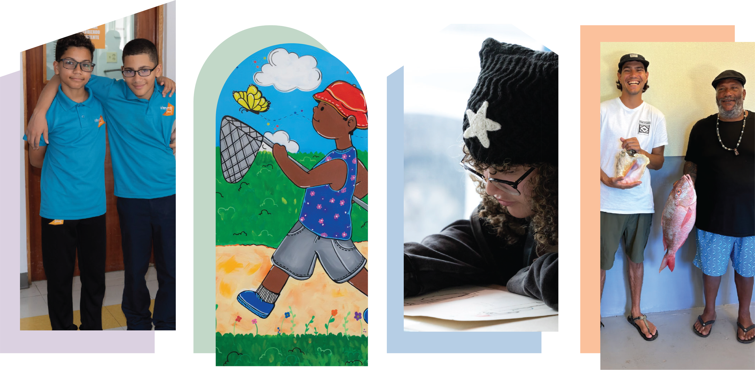
317 Main Community Music Center
317 Main is a Yarmouth, ME based non-profit focused on bringing the power of music-making to people from all skill levels and backgrounds. As a small but mighty team, they had outgrown their existing website and were looking for an updated version that presented the many different ways they show up in the Maine community more clearly, showcased their purpose front and center, and brought their visual brand to life in a playful but still polished way.
Over the course of 5 months, we worked closely with their internal marketing team to create a new site with them from the inside out.
Through a combination of a community survey, user persona analysis, and internal interdepartmental working session we learned that the top website need was to find out information on current programming (when was it, who was it for, how much is it and how do I register). We also learned that a top frustration with the existing site was ease of navigation - in some areas too much information, and others not enough.


To help guide visitors to the content they needed, we broke programming into two buckets based on core user groups - youth and adults. We also added intro paragraphs to each section grounding new visitors in the overall suite of offerings, worked closely with the Registrar to streamline registration language, and prioritized imagery of real students and classes to help bring the 317 Main experience to life.

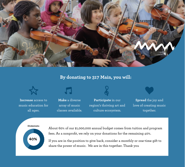
Across the project, site accessibility was a priority in both design and content choices, making sure it translated well to mobile and was created with key users needs in mind.
A secondary key need was for users to be able to find ways to donate and to understand what they were contributing to. Re-worked copy streamlined a variety of different ways to support, and leaned into content highlighting the deep purpose behind their work.

case study - creating tools for support
Portland Public Schools Food Service
The Food Service department at Portland Public Schools is a stand alone, self-funded department serving the largest school district in the state (over 6,500 students). Their work had evolved greatly, featuring a new vegan line of meals, regularly incorporating local ingredients, and partnered with a diverse group of community organizations, yet the branding tools they had were limited and did not reflect this new vision.
We worked together to first help bring to life core values-based messaging capturing the evolution they had gone through. These tools were developed to both create clarity externally and drive meal participation across the district, but also to drive awareness internally of the broader impact each food service team member’s individual work was serving.
From this foundation, and with the support of a Farm to School grant received by Cumberland County Food Security Council, we worked with the Food Service team as they pivoted rapidly to adapt to COVID and serve their community. Together, we navigated the balance between planning for now when they are working very differently, and to plan for a future when students are once again gathering in cafeterias. We developed a visual brand identity in alignment with the existing Portland Public Schools brand guidelines, a communications plan, and a suite of visual tools to use to share this new brand with their community that they could use both. The work brought to life a playful, polished brand with tools the team can continue to use in their day to day communications.

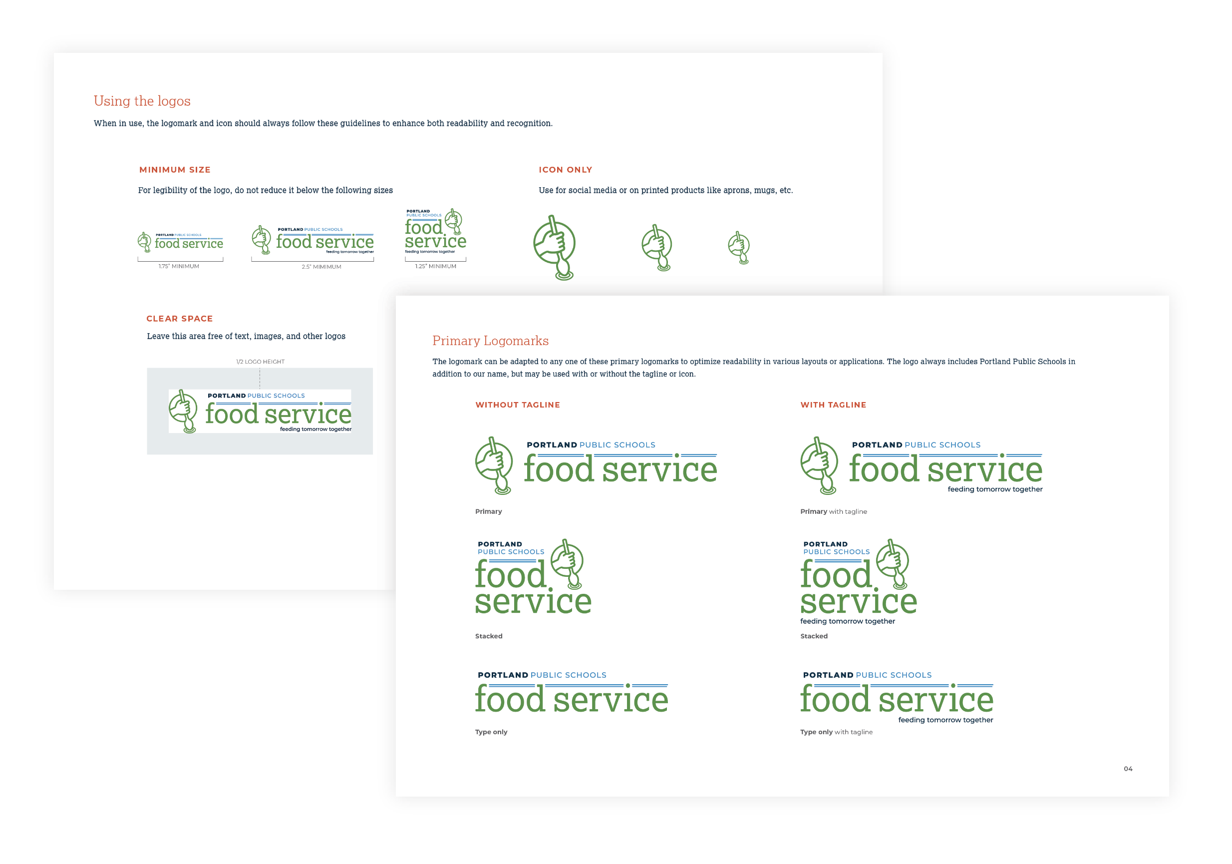

We provided the PPS team with comprehensive brand guidelines, an editable “Food Service 101” slide deck for new hires and internal presentations, and a suite of Canva templates to execute their communications goals.


We created a variety of assets that could be used as printed assets like posters and postcards, or as virtual assets on the website and for social media.
This included a family of custom illustrations that help carry the brand across items like letters to parents and menus.


case study - getting the word out
Maine Women’s Business List
Last fall the Women’s Business Center at CEI approached us about supporting them with the launch of the Maine Women’s Business List, Maine’s first public directory of woman owned businesses across the state. A response to consumers and commercial product sourcers wanting to purchase from enterprises across the state that are owned by women, the goal of the directory is both to increase visibility for female entrepreneurs as well as gather much needed data about the role of women in business in Maine.
With the bones of the database, name, and general design direction in place, we focused on an awareness campaign that leveraged the deep relationships of the WBC and made it easy for partner organizations, participants and CEI and the Women’s Business Center to spread the word.
We created a standardized logo for the directory, a suite of social media assets for each audience and custom posts for the WBC. A deeply collaborative effort, we worked together with the team at the WBC to finesse the language and user flow on the website to showcase three clear calls to action: SIGN UP, SHARE, and SHOP, as well as tell the story of why shopping woman owned is so powerful. We crafted copy to include in announcements in newsletters from the WBC and CEI as well as a template for 1:1 outreach to partner organizations. We collaborated with PR maven Christen Graham to brainstorm ways to get the word out about this resource, and put all the pieces together into a roadmap for the WBC team to carry forward through execution.
We’re proud to be a part of spreading the word about this great resource, as well as members ourselves. Whether you’re a business owner or looking to support women in business, the directory is free to join and easy to search.


We created tool kits for partners and members to use to share the directory. These included assets for social media, emails, and a badge for embedding on a website. We also provided CEI Women’s Business Center with a suite of promotional materials to share across their channels.

“Working with Leah and India provided exactly the support I needed as a small business owner. They work seamlessly together as Leah helped me shape the larger purpose and value of our client service offerings and India artfully interpreted these concepts into beautiful visuals for our website and external marketing materials. In addition to being insightful and talented, they are also super fun to work with! They have a way of helping me cut through a sea of ideas and clarify those that matter most.”
— Elizabeth Ross Holmstrom, Founder, Mindful Employer